HENSHAWS

BRIEF
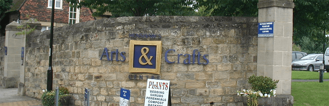
Henshaw's were going through a large re-brand in 2016 as their current branding was looking dated and tired. The Arts and Crafts centre and the College had the same branding and they wanted each premises to have there own identity. This was achieved by making the signage at the Arts and Craft centre shades of pink and the College was in shades of blue..
SOLUTION
Here is an image showing the stages we go through to create the final product. The designs and measurements are part of the proofing stage giving the client an idea of the finished look. As Henshaws is a charity for the blind and partially sighted, braille was added to various signage around the site.

“Thank you for
a professional
job as always”

OUTCOME
We worked closely with Henshaws to create various signage that would look great visually and work well for the blind and partially sighted. Overall the signage in both locations looked professional and stood out well in their new brand colours. Henshaws were very happy with the overall outcome.


